

Listen to the Podcast
Available on your favorite platforms
⬇️ Prefer to listen instead? ⬇️
- 94% of users form first impressions based on website design.
- 75% of credibility judgments come down to visual aesthetics.
- Scroll-based storytelling and full-screen visuals dominate 2024 web trends.
- Mobile-friendly websites rank higher and retain users longer.
- Emotional and interactive designs increase user engagement by up to 2X.
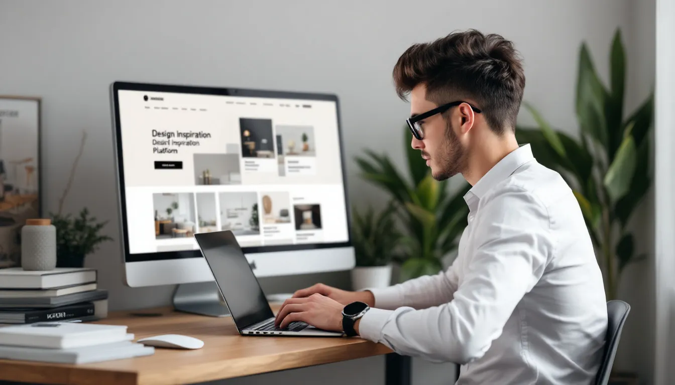
Today, your website design is more than just looks. It's like your store, your first meeting with customers, how you get leads, and how people trust you. 94% of first impressions come from design. And 75% of people decide if they trust you based on how your site looks. So you really need to pay attention to it. But what makes the best websites good? And what trends fit your business? Let's look at 30 award-winning websites and the main trends that helped them.
130 Award-Winning Website Designs to Know
Modern websites, from simple portfolios to those with deep stories, are getting awards from places like the Webby Awards, Awwwards, and CSS Design Awards. These sites aren't just nice to look at. They are new, put users first, and really show what the brand is about. Here are some examples that are now seen as top quality and creative in web design.
Notable Examples:
-
Cowboy (E-commerce) Cowboy won Webby's Best Visual Design in 2024. It has a clean, black and white look that makes its strong product pictures stand out. Its simple style makes it easy for buyers to go through the steps needed to buy. This highlights how sleek the product is. It's a good way to design now, focusing on being clear and making people feel something.
-
Runway (Finance) This website does well when many financial sites don't. It doesn't feel cold or too much to handle. Instead, Runway uses a background that looks like clouds all the time and a smooth way to scroll. This makes looking at money info feel easy to get. It shows how an idea for a brand and being easy to use can work together well.
-
Just Curious (Blog) This blog won People's Voice for personal blogs. It shows how using empty space, easy ways to read, and focused pictures can make a simple blog feel calm and pull you in when you read it.
-
Jeff Koons: Moon Phases (Art Installation) This site is a great example of focusing on one story. It shows visitors visuals that follow Koons' space art. Scrolling animations and smooth transitions turn looking around the site into an emotional experience.
-
Santa’s Magical Mailroom (Engagement + AI) This site for a seasonal campaign mixes AI with fun stories. It lets people create content together by using AI to make letters from Santa. The site gets kids and adults interested with features that feel personal.
Other standout mentions:
- Google Fonts – Best User Interface. It's known for its UI filters that work well and a tool to see changes live.
- Persepolis Reimagined – A history site you scroll through, using compelling 3D pictures.
- Vention’s AI Editorial Report – Got an award for how its UX design works when you scroll and for its layout made of parts.
Key Design Patterns Emerging Across Top Websites
Looking at the best website designs today shows patterns that come up often. These patterns help users interact with the site, find their way around, and recall it later. These ways of designing aren't just about what someone likes. They are based on what users do, how people use devices, and how our minds work with user experience.
Key Design Trends:
-
Scroll-Based Storytelling Scrolling that tells a story holds users' interest. For example, National Geographic’s “Secrets of the Elephants” presents complex info in small, easy-to-understand parts. This works well for places like museums, groups that help others, and news sites.
-
Engaging Pictures + Video Backgrounds Videos that fill the screen, animations, or moving photos quickly set the mood and feel. These are extra helpful for brands about how people live and for products that show how well they work. They get people emotionally interested in the first five seconds.
-
Navigation that is Simple Using less on the page, like hamburger menus or single pages you scroll through, helps users find where to go without thinking too hard. Often, designers now show just one main button for action first. This stops people from feeling like there's too much to process.
-
Movement That Reacts Small animations, things that happen when you move your mouse over them, and scrolling that moves the background slower than the front don't just look nice. They guide the user's eyes and give small hints about what's happening.
-
Same Brand Look Everywhere Having the same look, from colors to buttons that ask you to do something, helps make the brand stronger. The top designs match how they look with being easy for everyone to use. This builds trust right away.
These ways of doing things are basic for modern website design that works well. They are for both phones and computers.
Aligning Website Design with Brand Voice
A common mistake when making a website is using a popular design that doesn't match how your brand sounds or who you are trying to reach. The best website designs work because they show the brand's character in everything the user does on the site. This includes how text looks and how navigation hints are given.
Strategic Questions to Ask:
-
Do the colors make people feel what you want them to? Soft colors can show a feeling of calm. Bright colors can suggest new ideas or being young.
-
Does what the text says match the pictures? For example, a fun software company might use playful animations or sets of small pictures to balance out serious words.
-
Is the site easy for your users to figure out? For older people, keeping it simple and easy to read is usually better than layouts that try new things.
Examples in Action:
- Just Curious: Acts like calm, thoughtful reading. This matches its personal essays.
- Jeff Koons’ Moon Phases: Shows off art that tries new things by using layouts that don't go in a straight line and pictures you can interact with.
Putting your brand's voice into the site's look, the buttons that ask you to do something, how headlines look, and the style of pictures makes everything fit together. This builds trust.
How UX and UI Principles Are Changing
Modern website design is more and more influenced by ideas about UX (how a user feels using the site) and UI (how the site looks and works). These ideas put being easy to use first, more than just looking fancy. The best designs mix nice looks with being very easy to use.
Trends Earning Awards:
-
Google Fonts: You can see changes live. It has clear filters for searching. And the contrast changes based on text color. These things made it a great example of UI. It shows that being easy for everyone to use can also look good.
-
Raw Materials & Vention: They use sidebars on the left that are organized. This makes it easier to take in the info on long pages.
-
Loads Fast & Works Smoothly: Sites like Cowboy load things smartly, using methods like lazy loading and prefetching. This helps the site work better and faster, which Google measures.
-
Make it Easy for Everyone: Sites that use colors with strong differences, let you move with the tab key, use ARIA labels (which help screen readers), and have large, clear writing are seeing fewer people leave right away. This is true even for average users.
📌 Tip: If a site is confusing, the UX isn't good. Use tools that watch user sessions, like Hotjar or FullStory, to make the site's look better.
Design That Users Can Interact With for Today's Users
Websites that aren't interesting don't get people to do what you want. The best websites in 2024 grab users' attention right away with movie-like intros, ways to click and move around, and stories told in parts.
Notable Examples:
-
Santa’s Magical Mailroom: Making people feel something mixed with interactive AI shows how design that reacts to what the user does leads to people spending more time on the site.
-
Shupatto: When you scroll, things move to show its foldable bags being used. How the bags work is built into the design. This is a strong mix of showing the product and being easy to use.
-
Persepolis Reimagined: Guides with different types of media, 3D views, and a way to move around by chapters make this feel like walking through history online.
📈 Websites that don't change average less than 90 seconds per visit. Designs you can interact with and that feel personal often see visits last more than 3 minutes.
Mobile Optimization: No Longer Optional
More than 60% of internet use worldwide is now on phones. Having a design that works well on phones is not just a nice extra—it's needed. Websites that change based on the screen size are key. They are important for being easy to use and also for showing up in search results.
What Modern Mobile Optimization Includes:
-
Parts You Can Easily Tap With Your Thumb: Buttons that ask you to do something and areas you can click that are easy to tap help stop people from leaving right away on smaller screens.
-
Navigation That Stays Put and Headers That Follow You: These are extra helpful on shopping sites and sites showing your work. Users scroll a lot on these sites to see products or projects.
-
Text + Pictures That Adjust: These stop writing from going off the edge of the screen. They also stop pictures from not lining up right when the view area is stretched.
-
Looking at Phone Designs First on Pttrns: Sites shown on Pttrns are good examples of designs that change smoothly for phones. They have specific layouts for things like buying, signing in, and dashboards.
Tools for search results now check how well a site works on phones first. Sites that don't meet key standards for how fast and smooth they work might have trouble showing up in phone searches. This is true even if their content is great.
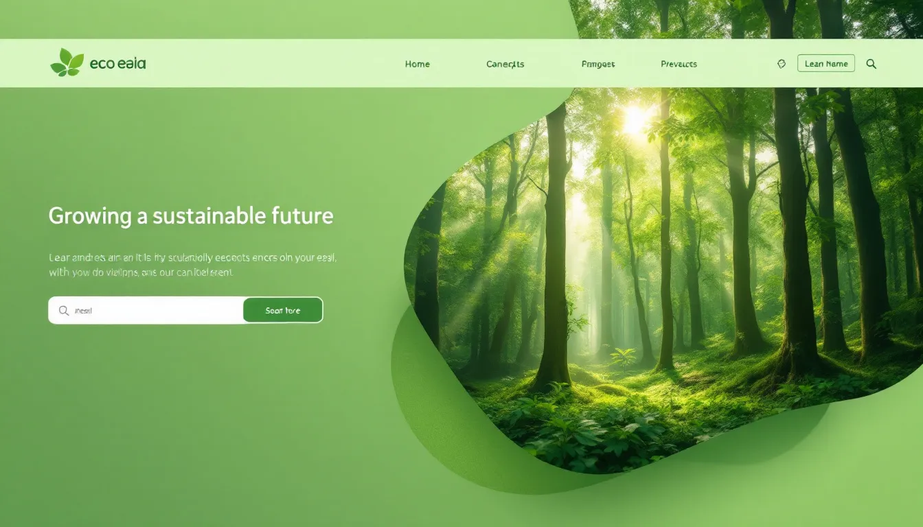
How Design Can Help the Planet and Tell Stories Visually
Web designers are using websites more and more to talk about bigger topics. This includes taking care of the environment and telling stories with data.
Mission-Driven Design in Action:
-
What Is Missing: Uses sound, very few colors, and a way to move around like a timeline to show people the loss happening on Earth.
-
Prodigioso Volcán Audio & Voice Report: Takes complicated data and turns it into a story you can hear and see graphics for. It's a great example of being easy for everyone to use and making a big impression.
📘 Adding stories that make people feel something can make a site reach more people. This makes it easy to remember and share. It works even in business-to-business situations.
🌍 Design that thinks about the planet also includes ways to lower carbon use. This means things like not having videos play by themselves and smartly making files smaller.

Your Go-To Sources for Website Design Inspiration
Feeling stuck? Try looking online in a better way. These websites always show new ideas in modern website design:
-
Behance: You can look for work from designers around the world. Or search for specific types of businesses or design styles popular in different countries.
-
Dribbble: Find people who design website looks, layouts for early app versions, or specific design styles. You can search using keywords or groups.
-
Awwwards: Shows the best designs every day. See what the top design companies are trying out now.
-
Pttrns: Focuses on design patterns for phone user experience. It groups them by what the page does. This is helpful when checking how easy your site is to use.
TIP: Also look away from your screen. Magazine layouts, stores, and restaurant menus can give you ideas you can feel.
Best Practices Anchoring the Web’s Top Designs
Being creative makes your site different. But planning and doing things well is what makes sure it works.
Always Check These Boxes:
- Put the main buttons for action in clear spots where users will see them.
- Use different sizes or styles of text to make it easy to read.
- Use empty space to make the page look less crowded.
- Have navigation menus that stay in place or move with you on long pages.
- Have an SSL certificate (for security) and handle data in ways that follow GDPR rules.
- Break up content into smaller parts to help people who scroll slowly.
For example, Vention's report style breaks down data into parts you can easily understand by using animations and bright blocks. Even with a lot of info, it doesn't feel like too much.
Pair Aesthetic With Smart Content
Just looking good won't get you results if your content is not clear. The best websites improve how they look and what they say at the same time.
Tactics to Sync Content and Design:
- Use tools to manage your website like Webflow or WordPress that have parts you can easily change.
- Show reviews next to sliders or carousels that open up.
- Put blog posts that use good keywords under popular pages.
- Add charts or small data points to headlines that are good for search engines.
After your design impresses people, good content helps them stay longer, helps your site be found in searches, and helps you get results.

Design With Emotion—and a Bit of Personality
Websites that look plain and boring are not the way to go anymore. People who visit your site want to feel something—like surprise, happiness, energy, or even wanting to know more.
Easy Ways to Add Personality:
- Make special 404 pages (for pages not found) with jokes or animations.
- Use short bits of text that sound like your brand (like saying “Yes, I want this magic!” instead of just “Submit”).
- Include notes from the founder or stories about the people on your team. You can do this even on the About page of a shopping site.
- Use real photos when you can, instead of stock pictures that look fake.
What’s Coming in 2025? Design Trends to Watch
As technology, what browsers can do, and AI that creates things keep getting better, web design will change again. Get ready for trends that will focus more on smart features and making people happy.
Emerging Concepts:
- AI-Personalized Layouts — Site looks that change based on what you do.
- Site Parts Based on Video — Like watching a show with controls, but for a website.
- Using Your Voice to Browse — Moving past just being for people with disabilities to being tools everyone uses daily.
- Website Pieces You Can Mix and Match — Making it quicker to update sites and let them grow, using smaller parts.
- Trying New Things with Text — Text that moves or changes size to help tell a story.
Check out sites that show design ideas and look at who's nominated for Awwwards. This will help you know what's coming.
Should You Redesign Your Site Now?
Changing your site's design isn't only about how it looks. It's about how well it works, if it gets people to do what you want, and if your brand looks the same everywhere. Here are signs you might need a new design:
- Lots of people visit, but more than half leave right away.
- People don't stay long on the site or do much.
- Many people use phones to visit, but few do what you want them to do.
- The text and pictures don't seem organized or linked together.
- Other sites like yours feel easier to use, look cleaner, or seem more trustworthy.
🛠️ Fixing things doesn't have to cost a lot of money. You can start by changing how your content is set up. Move your main buttons for action. Update your pictures. Or change to a template that works well on phones.
Your Website Is More Than Pixels
The best website designs mix looking good, being smart, and having feeling. Every time someone scrolls, clicks, or moves their mouse over something, it's a chance to build trust, teach them, and get them to do something. As trends change, always focus on helping your users. Do this with a clear purpose and design that makes people feel something.
If you're making a site to show your work, putting out something new, or giving your blog a fresh look, use design to show who you really are. Do it with a reason, with strength, and make it exact.
Written by
Rocket Agents
Part of the Rocket Agents team, helping businesses convert more leads into meetings with AI-powered sales automation.


Ready to Convert More Leads?
See how Rocket Agents can help you respond to leads instantly and book more meetings.